Design Principles Study Task 8: Colour Theory
How can you subtly present a theme in the book (Norwegian wood) using only colour?
Could present a number of moods through a set of icons/covers displayed on a grid system. Like a set of books for each theme/mood.
Josef Albers - Suggesting a form on a 2d flat painting
Johannes Itten - Came u with 7 mythologies for coordinating colour using hues


Contrast of Saturation
Formed by the juxtaposition of light and dark values and their relative saturations
Contrast of Extension
Formed by assigning proportional field sizes in relation to the visual weight of a colour. Also known as the contrast of proportion.
The intensity of the hue diminishes as hues are removed from the three primary (red yellow blue)
love triangle of desperate motives
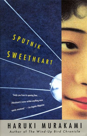
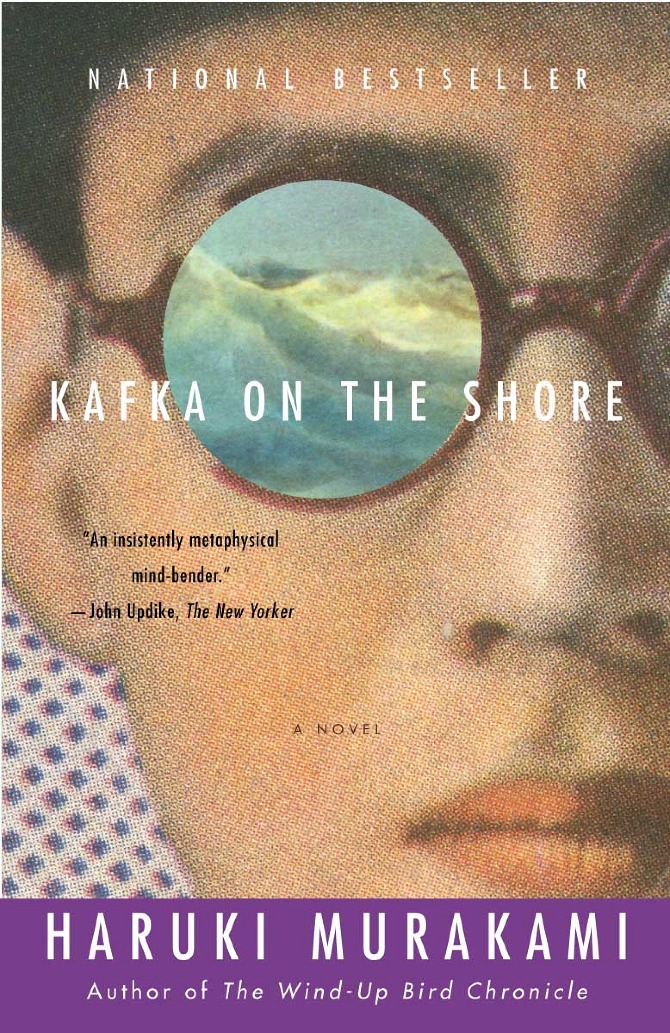
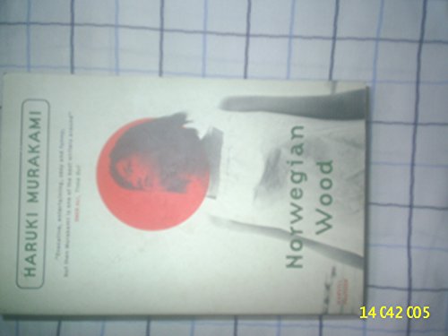
Colour used within Murakami Book Covers
The elephant vanishes


After dark

Strange library


Columns give a sense of separation or a barrier between the reader and and the figure on the cover. The grey colour being placed over a more complex image, creates a juxtaposition that creates a sense of tension on the cover. Do I want to create a sense of tension or other mood on my cover?

The colour and placement of the columns in this image offer a more welcoming vibe as the dispersed/narrowing columns look give the illusion that they're falling into the centre of the cover.


Dots/shapes could be place/arranged in a form that mapping/grid formation that relates to a theme in the book or from Murakami.

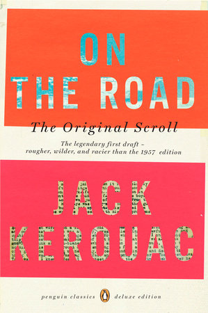
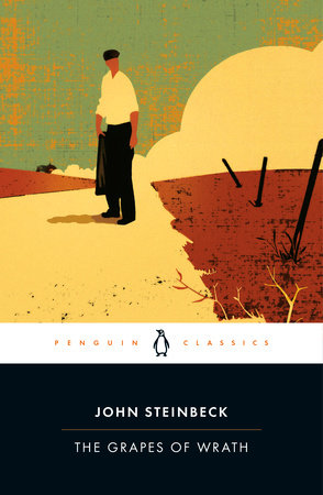
Colours used within classic Penguin covers
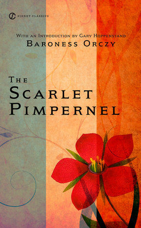
How is colour used within the genre of your chosen book (coming of age/fiction)?


History of Book Design

Gold illustrations (1840-1860)

Medieval is the new chic

The belle époque of illustrators (mid-19th ~ early 20th century)

The illustrated colour cover

The Yellow Book fever


The impact of war: freedom and russian influence


1937: incubator, pelicans and special edition

Birth of graphic design (1945)

50's paper back woman and glam: small game (pretty difficult)


60's abstraction, science fiction and graphic design (photography)

ultra-realism leaves room for the imagination

70'S
he 70s bring their share of psychedelia, flashy colors, art, and a form of freedom of thought that is transcribed in a graphics freed from the constraints of the last century.


Zulma, recognizable by its white triangle cartouche on a colored paper background.

No comments:
Post a Comment