Study Task 3 Kerndown
How can I use kerning in my logo type for OUGD403 brief 2.
OUGD404 focuses on processes that can be used to develop work in other modules.
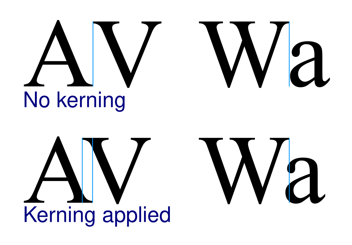
Kerning - 'the spacing between letters'
Can be used as metaphor like in FedEx logo. the connection of the d and e suggest a completeness.
Personality and tone of voice should be considered when considering spacing of text.
Word 1 Lifestyle magazine
The kerning used in this set of letters is space unevenly to present themes of proximity, similarity, continuity, closure and connectedness; similar to that presented in real life.

The kerning used in this set of letters is space unevenly to present themes of proximity, similarity, continuity, closure and connectedness; similar to that presented in real life.

Word 2 Condom manufacturer
The kerning in this set of letters is small and compact to resemble an image of solidarity and reliability. The type is also place on a 90 degree base line to further communicate the metaphor of a bona fide form of protection.

The kerning in this set of letters is small and compact to resemble an image of solidarity and reliability. The type is also place on a 90 degree base line to further communicate the metaphor of a bona fide form of protection.

Word 3 Insurance company (close and far away - rates)
This kerning used in this typeface is split between different distances to show the ever changing prices of insurance in the UK. While this may not be the reliable message an insurance company would want their customers to associate with them at first site. We felt it was an eye catching contradiction to the norm of high street store signs; that would catch the customers eye.
This kerning used in this typeface is split between different distances to show the ever changing prices of insurance in the UK. While this may not be the reliable message an insurance company would want their customers to associate with them at first site. We felt it was an eye catching contradiction to the norm of high street store signs; that would catch the customers eye.

Word 4 Indie music festival
The kerning and baseline in this typeface have been arranged in a form that resembles a musical rhythm. With a fast food stall in mind this, off kilter typeface wouldn't look out of place, but would definitely catch the eye of wigged out festival goers.
The kerning and baseline in this typeface have been arranged in a form that resembles a musical rhythm. With a fast food stall in mind this, off kilter typeface wouldn't look out of place, but would definitely catch the eye of wigged out festival goers.

Ligatures
'&'
The ampersand is an ld connected letter or ligature. It contains often barely recognisable two letters meaning and 'e' and 't'
Develop a new ligature for a contemporary acronym/phrase. OMG WTF LMFAO BAE LIT
The new ligature should be for one of ten typefaces listed in the Vignelli Canon.
Who's the audience. the visual language of the ligature should communicate this
Create 10 forms on illustrator from sketches in book. - Use Experimental jetset for inspiration


No comments:
Post a Comment